|
Smooth Speed, implied!
Ted did a lot of work on his new rink. He'd spent 18 months in the US Army, got five promotions, and "won the war" (his part of it, certainly) to come home to a dream: not the old rink, but a brand new one. You saw photos of it on the previous page.
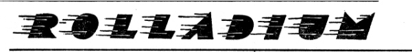
Somewhere between the time he got home, late in 1945, and Feb. 20, 1947, he crammed in a lot of work -- the logo above is only part of it.
Civilian Covers Lots of Ground
He managed to take evening classes in Business at San Mateo Junior College (later College of San Mateo) while working days for Arthur Brothers Construction -- who supervised construction of the skating rink.
He managed to save his "world biggest skate" (home page) and was able to save the clamp skates, and the hardrock maple floor, of the old rink -- pulling up the old floor himself. Of course he had to trash out the ones that'd received bolted equipment, and so forth.
And, supervise the architectual drawings (not shown: insufficient free space), plan his advertising, his promotional tools, and draw the logo above.
He believed the lean of Rolladium (which is almost italicization) lent authority to a modicum of forward motion ("speed") ... using the sans serif block letters represented the newness of the rink, and the solidity of its owners; add in the lines from each letter -- and you have SMOOTH SKATING, our byword for our many years of ownership.
Ted was a sign painter among other benisions, and did all the rink's interior signs. He did go outside, to a union printshop, to have his many skating show and competition posters made up. We regret not being able to include them on this site, their size is such they'd be almost unreadable when shrunk.
|